The consumerification of the enterprise at Datameer
Transforming an enterprise product into a human-centered one and overcoming the organizational challenges of an internationally distributed team.
Simplifying the B2B experience for Spreadshirt
Creating a long-term UX and product strategy that effectively serves the user and the business
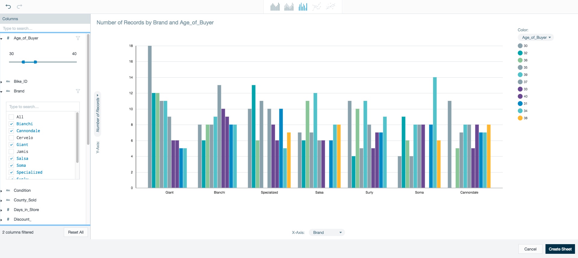
Datameer needed a win. UX had just recently been established and the last major release suffered from solutionizing and delivered something users weren't quite asking for.
In addition, the growing team was dealing with the difficulties of accessing users in secretive corporations and a globally distributed workforce.
Before
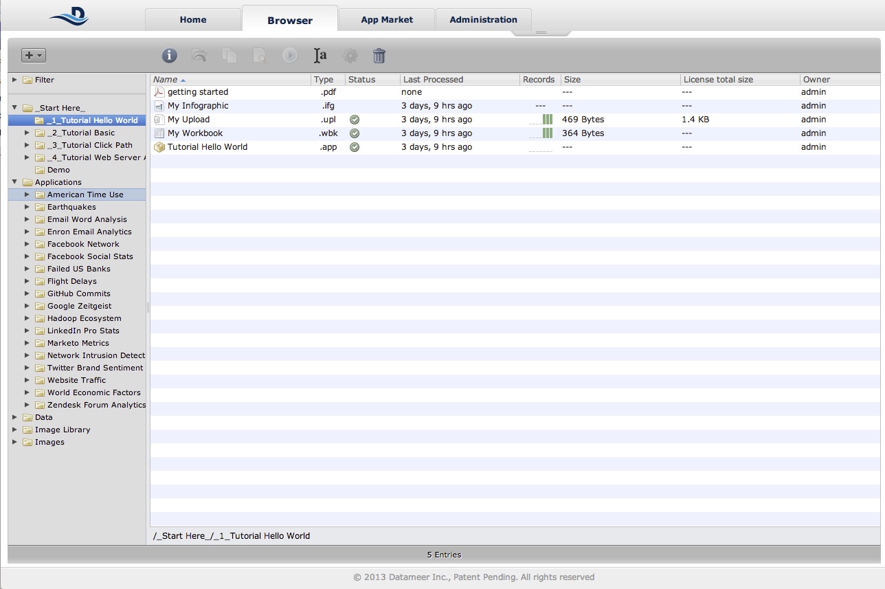
Because of the issues with the new version, most customers kept using the previous version, which increasingly felt outdated. Users were looking to the competition for better usability, faster journey completion and better visualization capabilities.
Spreadshirt was in need of a reinvention of their B2B experience. After several failed initiatives, this attempt had to work.
Spreadshirt is one of the world’s leading eCommerce platforms for print-on-demand apparel, offering consumers a marketplace for customizable clothing as well as DIY tools to create personalized items. The same tools are made available to businesses looking for mass-customization tools, on-demand production, and fulfillment as a service.
Problem
While the B2B product offering was an important pillar for the overall business it had gotten little attention and was stuck on a legacy technology stack and unsure of its potential and future. Activation and retention proved increasingly harder as time went on. The business was facing decreasing sign-ups and realized that too few new users were becoming successful.
After
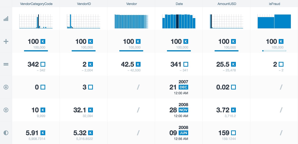
After two years of strategic work, we were able to turn the product around. It is more stable, significantly more usable and offers the right features in a way that is meaningful for our users. Where previously new feature announcements could be met with scepticism, now our teams are receiving standing ovations over the increase in productivity and value they get from the software.
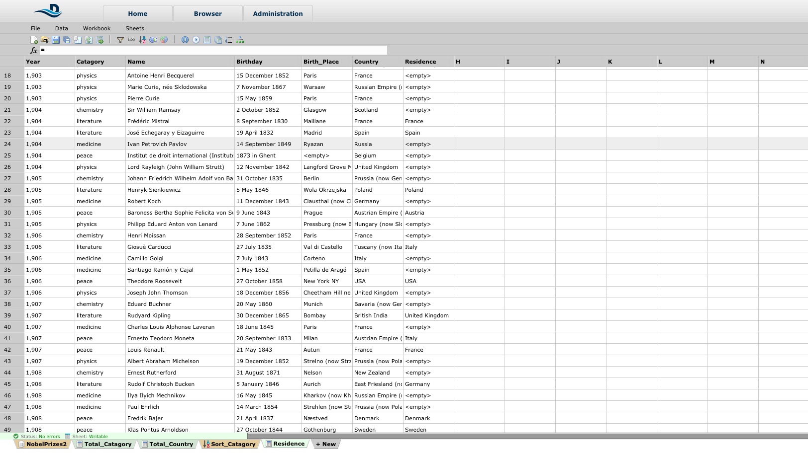
BEFORE: The platform had grown over time without a real focus on the needs of the B2B user. It was cluttered and user had a difficult time understanding how to accomplish their goals.
Business Hypothesis
The business’ hypothesis was that if only users would have an easier time to publish on all platforms with one click they would create more designs and increase revenue.
Outcome
Throughout the project identified that the create-once-publish everywhere approach was meaningless and potentially even detrimental to the success of our users. Through qualitative and quantitative research we were able to identify their jobs-to-be-done and describe the real picture of the user base. This helped the business make better-informed strategic decisions.
There is more...
Want to hear how we found a way to get a hold of our users, how we created a thriving culture of remote collaboration and increased the quality and quantity of our design input and impact?
There is more...
Want to hear about the drama, approach, the hot-tempered executive and how the third attempt at this project finally became a success and repositioned UX in the company?
Selected Works

Ninox Navigation RedesignProduct Management & Product Design

Reimagining Funeral Services for the Digital Age - DuplicateProduct Management & Product Design

Growing UX Maturity at SpreadshirtLeadership
Tobias Treppmann
Lückstraße 74, 10317 Berlin | hello@treppmann.design | +49 (0) 174-985-1562 | LinkedIn
