Simplifying the B2B experience for Spreadshirt
Creating a long-term UX and product strategy that effectively serves the user and the business
Simplifying the B2B experience for Spreadshirt
Creating a long-term UX and product strategy that effectively serves the user and the business
Spreadshirt needed to reinvent their B2B experience. After several failed initiatives, this attempt had to work.
Spreadshirt is one of the world’s leading eCommerce platforms for print-on-demand apparel, offering consumers a marketplace for customizable clothing, as well as DIY tools to create personalized items. The same tools are made available to businesses looking for mass-customization tools, on-demand production, and fulfillment as a service.
Problem
While the B2B product offering was an important pillar for the overall business, it had gotten little attention from the product teams and was stuck on a legacy technology stack, with little potential and an unsure future. Activation and retention proved increasingly harder as time went on. The business was facing decreasing sign-ups and realized that too few new users were becoming successful.
Spreadshirt was in need of a reinvention of their B2B experience. After several failed initiatives, this attempt had to work.
Spreadshirt is one of the world’s leading eCommerce platforms for print-on-demand apparel, offering consumers a marketplace for customizable clothing as well as DIY tools to create personalized items. The same tools are made available to businesses looking for mass-customization tools, on-demand production, and fulfillment as a service.
Problem
While the B2B product offering was an important pillar for the overall business it had gotten little attention and was stuck on a legacy technology stack and unsure of its potential and future. Activation and retention proved increasingly harder as time went on. The business was facing decreasing sign-ups and realized that too few new users were becoming successful.

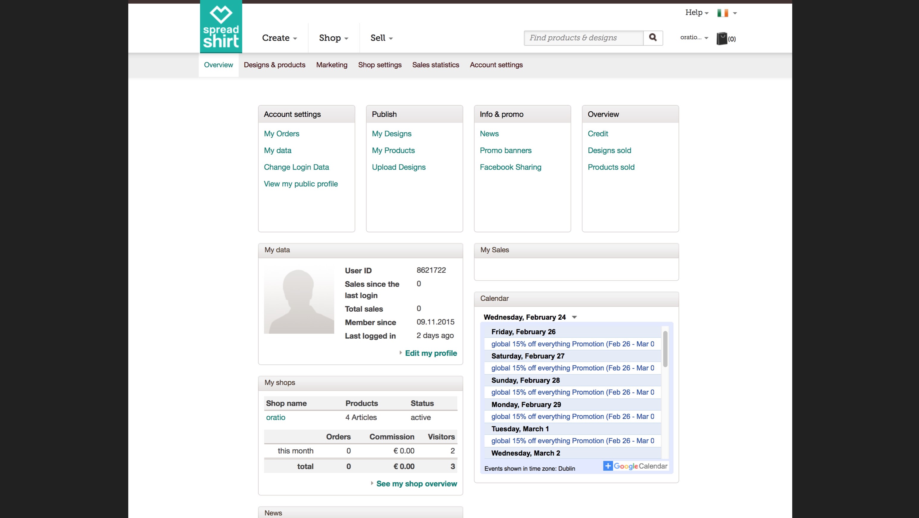
BEFORE: The platform had grown over time without a real focus on the needs of the B2B user. It was cluttered and the user had a difficult time understanding how to accomplish their goals.
Business Hypothesis
The business’ hypothesis was that if users could publish on multiple channels with one click they would create more designs and increase revenue.
Outcome
Throughout the project identified that the create-once-publish-everywhere approach was meaningless and potentially even detrimental to the success of our users. Through qualitative and quantitative research we were able to determine that users chose to focus on one sale channel that suited their needs, rather than publishing across multiple channels. This helped the business make better-informed strategic decisions.
BEFORE: The platform had grown over time without a real focus on the needs of the B2B user. It was cluttered and user had a difficult time understanding how to accomplish their goals.
Business Hypothesis
The business’ hypothesis was that if only users would have an easier time to publish on all platforms with one click they would create more designs and increase revenue.
Outcome
Throughout the project identified that the create-once-publish everywhere approach was meaningless and potentially even detrimental to the success of our users. Through qualitative and quantitative research we were able to identify their jobs-to-be-done and describe the real picture of the user base. This helped the business make better-informed strategic decisions.
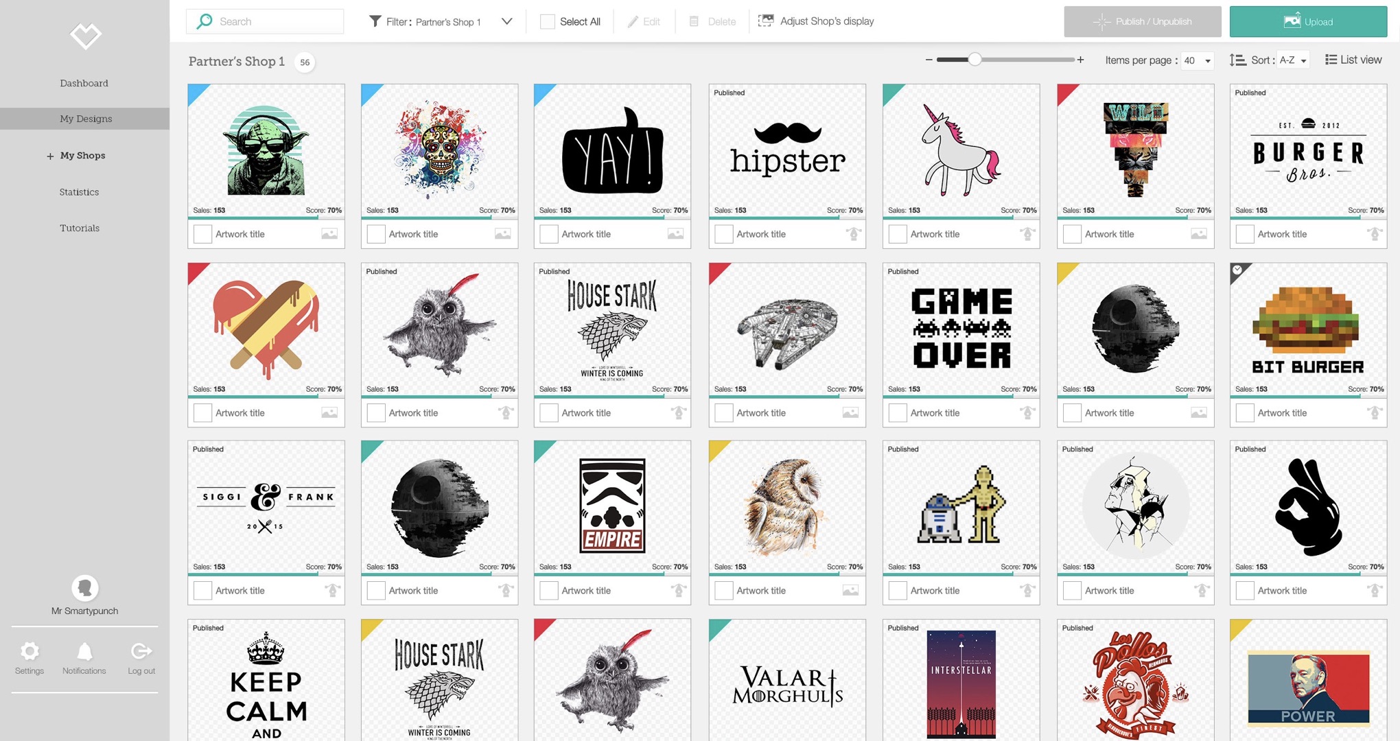
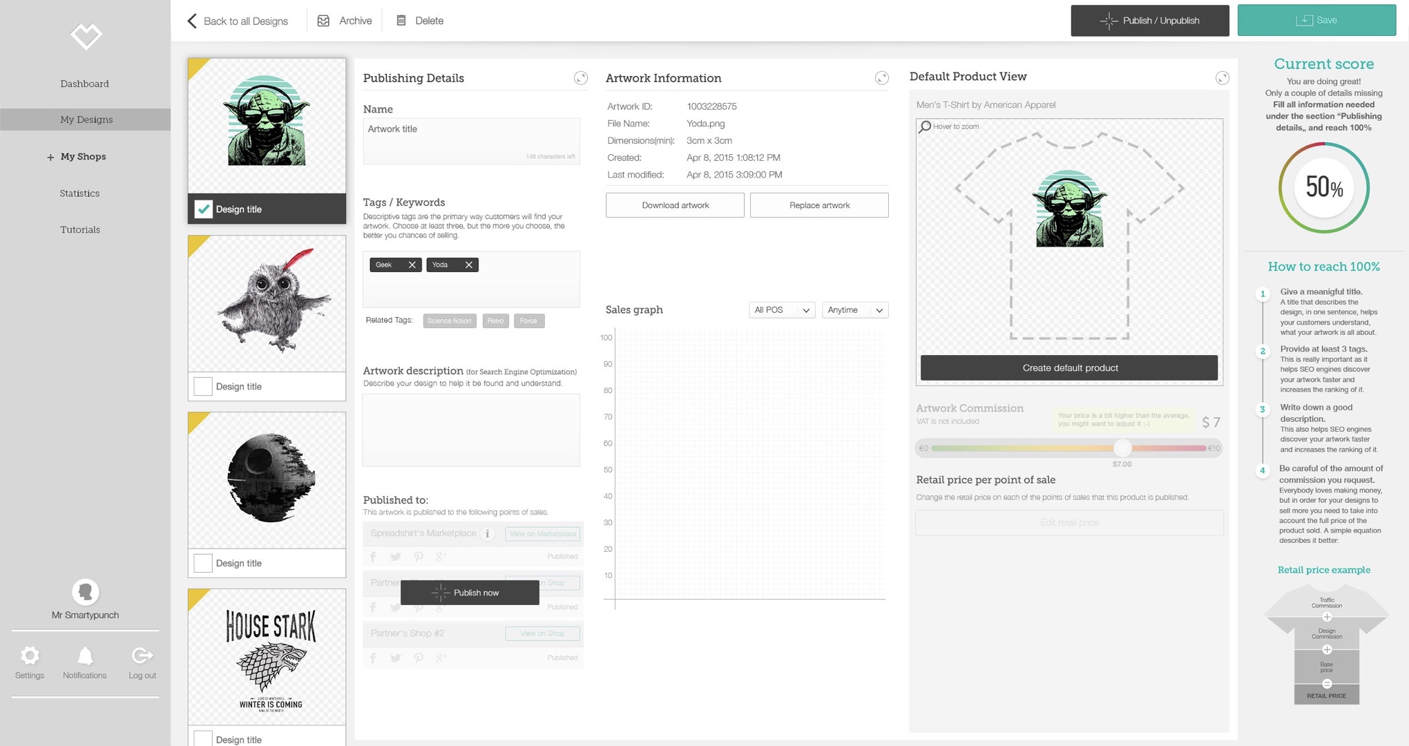
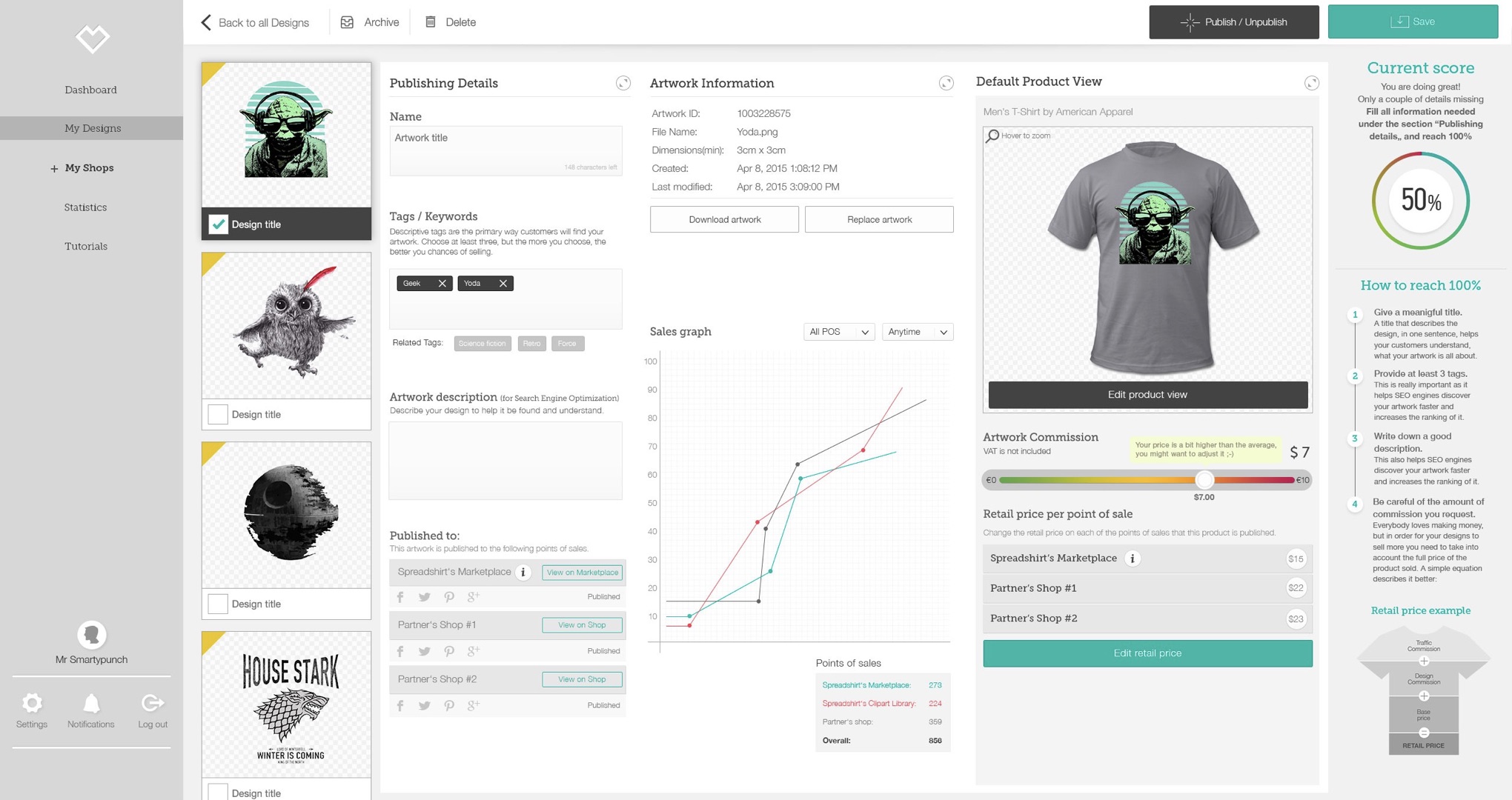
AFTER: Users now have an experience focused on what's important to them: their designs and how to monetize them. Users are applauding the massive change, are feeling heard, and are generating more revenue for themselves and the business.
There is more...
Want to hear about the drama, approach, the hot-tempered executive and how the third attempt at this project finally became a success and repositioned UX in the company?
There is more...
Want to hear about the drama, approach, the hot-tempered executive and how the third attempt at this project finally became a success and repositioned UX in the company?
Selected Works

Ninox Navigation RedesignProduct Management & Product Design

Reimagining Funeral Services for the Digital Age - DuplicateProduct Management & Product Design

Growing UX Maturity at SpreadshirtLeadership
Tobias Treppmann
Lückstraße 74, 10317 Berlin | hello@treppmann.design | +49 (0) 174-985-1562 | LinkedIn


