← Back to portfolio
CASE STUDY · BIBEL TV · 2026

An LLM-safe design system for people who didn't build it

Head of Product Design

Design-led infrastructure, with an engineering partner. Hamburg / Berlin

Bibel TV has no in-house design team. A new design language was landing, and the people who needed to build with it were product managers and engineers. So the design system had to become self-serve, for prototyping and as the engineering reference, without quietly drifting out of spec the moment nobody was watching.

The problem

Bibel TV has no in-house design team. That single fact determines the shape of everything else.

It means there is no designer to ask when something is ambiguous, no team maintaining a Figma library as the canonical reference, and, most consequentially, nobody whose job it is to catch drift in review. Every design system I've worked on has the same soft spot: the tokens exist, the naming is thought through, the documentation is written, and then enforcement is a person noticing. Tokens are a convention held up by attention. When nobody is paid to pay that attention, the convention is decorative.

So the direction was set before any of this tooling existed. Storybook would become the source of truth rather than a Figma file, one place where the components are real, runnable and inspectable, with a prototyping layer on top of it, so that both prototyping and engineering reference are transparent and self-serve. A new design language was landing, and the people who needed to build with it were product managers and engineers, not designers.

What I hadn't accounted for was how fast that gets away from you once an AI assistant is in the loop. Prototyping the Android redesign myself, I watched it confidently reference tokens that did not exist, and quietly hardcode values where a token did.

Both mistakes compile. Both render. A hallucinated token name falls back silently and looks approximately right; a hardcoded value looks *exactly* right and is invisible until someone changes the palette and one card doesn't move. I know this system as well as anyone does, and I still couldn't catch these by reading.

That's what turned a documentation problem into an enforcement problem. The docs were already good. What was missing was a mechanism that doesn't depend on anyone reading them, because in an organisation without a design team, the build is the only reviewer that always shows up.

Three layers, doing three different jobs

  1. The build refuses off-system work

    Six checks, one command, identical locally and in CI. Two are new and cover exactly the mistakes I'd made myself: one rejects a reference to a token that doesn't exist, the other rejects a colour, size or duration written straight into a component. The rest guard the palette against acquiring a second grey, and protect the token names our implementation partner builds against.

  2. The vocabulary is handed over, not remembered

    An assistant asked to recall a token name will produce something plausible. Asked to choose from an enumerated list of the valid ones, it cannot invent. The same closed vocabulary, the system's conventions, and the checks themselves are exposed as tools it can call, so the compliant path is also the fastest one.

  3. Storybook is where the system becomes visible

    You cannot prototype with components you have never seen. Storybook is the shared surface, every component, every state, in light and dark, at phone through TV size, so a product person can find the right thing before writing anything.

What that looks like in practice

The three layers compound. Storybook makes the system legible, the vocabulary makes the right answer reachable, and the build makes the wrong answer visible before it ships. Any one of them alone would have been a partial fix.

The toolbar carries the switches that matter for prototyping: light and dark, phone through TV, and whether tokens come from the local build or the live API. The panel underneath reports which tokens the selected component actually consumes, so a value drifting off-system is visible in the same place you're looking at the component.

Storybook showing the BibelTV component library: the component list in the sidebar, theme and device switches in the toolbar, a token inspector, and a frosted-glass card variant rendered against a striped backdrop
Fig. 01The shared surface. Thirty components, theme and device switching, and a per-component token report, so someone who didn't build the system can still find and use the right part of it.
The resolved design token set grouped by tier, primitives, semantic, component, views, showing named colour ramps with their hex values
Fig. 02The closed vocabulary, grouped by tier. An assistant enumerates from this instead of recalling a plausible name, which is the difference between choosing and inventing.

Twelve pixels is not twelve pixels

A check that only says *no* is useless to a product manager. So failures name the token to use instead. The first version of that was quietly dangerous.

It was looking at a font size of 12px. It found a token holding exactly 12px and offered it as the fix. That token was a spacing value. Taking the suggestion would have compiled, rendered pixel-identical, passed review, and welded the size of our body text to the gap between two cards, so that months later, tightening a layout would have changed the typography. I'd written that suggestion engine an hour earlier, and I'd written it to be helpful.

Two numbers matching is a coincidence, not a relationship. Suggestions are now constrained to the property's own family, and a component's token is only ever offered to that component. Where nothing qualifies, the check says nothing at all.

That silence is the part I'd defend hardest. It means the system genuinely has no name for this decision yet, which is a finding worth surfacing, not a hole worth filling with the nearest number that fits. For someone who doesn't know the catalogue, a confidently wrong suggestion is worse than no suggestion.

Catching what reading can't

The same audit compared every web component against the native app it mirrors. One of the things it surfaced: a card's fallback gradient was aliased one layer too deep in light mode, so where the app rendered a soft ramp, the web rendered flat white. Nobody had spotted it, because there was nothing visibly *broken* to spot, just a gradient quietly not being a gradient.

That is the class of defect this work exists for. It isn't a crash and it isn't ugly. It's the system slowly ceasing to mean what it says.

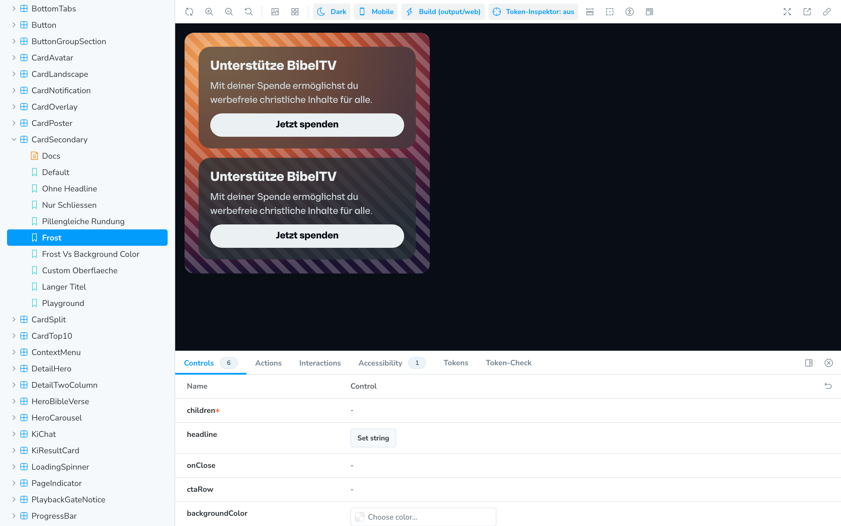
Two identical donation cards over a striped backdrop: the upper card frosted so the stripes blur behind it, the lower card plain so the stripes show through sharply
Fig. 03Same component, two states. The web mirror had only ever rendered the lower one, the app's fallback, because the frosted variant the app actually ships was never ported. Comparing surfaces properly is how that surfaces.

The escape hatch became the roadmap

Some values genuinely aren't design decisions: a black stop inside a mask gradient is alpha arithmetic, an icon font's optical size isn't a brand token. A rule with no exit gets worked around, so there's a documented one: annotate the line with a reason. Every annotation is recorded, and adding one fails the build until that record is updated, so an exception can never be taken quietly.

Then the register started telling me something I hadn't designed it to say. Of the sixteen exceptions in the system, eight say some version of "a token should exist here and doesn't." Written by whoever hit the friction, at the moment they hit it, with the reason attached.

That's a better backlog than I would have written from a workshop. It's in priority order by definition, the gaps people actually walk into, ranked by how often they walk into them.

Trusting the tooling, carefully

All thirty components were audited against the native source, and then every substantive finding was handed to an independent reviewer whose instruction was to *refute* it.

Eleven of forty-six didn't survive. Roughly a quarter would have become confident, well-argued, wrong changes to a client's design system. The same scepticism that motivated the checks had to be applied to the tooling that found the problems — otherwise I'd have automated the production of plausible mistakes instead of the prevention of them.

The findings worth the whole exercise were the ones that changed the question. More than once, something that looked like a missing token name turned out to be a genuine difference in how two platforms behaved, which needs a design decision, not a rename.

What changed

Enforcement
Tokens were a written convention, checked by whoever noticed in reviewSix checks, one command, identical locally and in CI: off-system work fails before it lands
Who can prototype
Effectively only people who already knew the token catalogueAnyone can describe a change and get an on-system result or a named, actionable refusal
Token gaps
Discovered in review, or neverThe system reports its own gaps: 8 so far, in the order people hit them

What it enables

Someone who has never opened the token file can describe what they want, *make the cards rounder*, and get either a change that uses the real system or a refusal that names what's missing. Never a silent off-system change that looks fine in a screenshot and fails six months later when the palette moves.

For designers, the shift is that intent now survives contact with people who don't share it. A token isn't a request any more. It's the only expressible option, and the alternatives fail loudly and early enough to be cheap.

And because the enforcement sits on the token source rather than on one platform's components, the same guarantee reaches Android, iOS, web and Figma, including the implementation partner building against those names, who now gets a breaking change announced instead of discovered.

What I took from it

The strongest version of this makes off-system code impossible to express at all, a constrained set of primitives where the wrong thing simply won't compile. I scoped it and declined it, for now. It's a large migration whose cost is certain and whose benefit is still unmeasured; checks that fail the build may prove sufficient; and every constraint has a cost at the edges, while this system is still gaining tokens weekly.

The exception register is the instrument that decides it. If it grows, the stricter version earns its migration. If it stays small and every entry stays honest, it doesn't. I'd rather ship the cheaper mechanism with a way to measure whether it's enough than buy the expensive one on principle.

The broader lesson is about where design authority actually lives in an organisation without designers. I used to think it lived in the Figma library and the review. It lives in whatever the build refuses. Everything else is advice.

Worth noting that others are arriving at the same conclusion from different directions, Polar's [Orbit](https://polar.sh/blog/orbit-llm-safe-design-system) makes the wrong thing fail to typecheck in a single web codebase, where this enforces across a token source feeding four platforms and hands the vocabulary to the assistant directly. Different mechanisms, same underlying bet: that a design decision only holds if something automatic is holding it.

Curious why the safest thing an automated suggestion can do turned out to be saying nothing at all, or why roughly a quarter of the audit's own findings didn't survive being handed to someone whose only job was to prove them wrong? Get in touch.