A color engine that automates what bigger streamers do by hand
Bibel TV has over 10,000 videos in its catalog and a team too small to hand-pick a theme color for each one — the work a larger streaming operation might fold into its artwork pipeline by hand. So the colors come from the artwork itself, computed. I built the engine that does it, in OKLCH, tuned to the brand's own needs rather than a generic extraction tool.
Why a custom engine, and how it works
Research ahead of the app redesign found that Bibel TV users associate the brand with hope, and expected that in the interface itself, not just the content — against the industry's own dark-mode default — a considered choice, not a habit: a dark frame recedes the way a theater dims its walls, so artwork and video carry the screen instead of the interface competing with them. Taking that seriously meant the colour engine had to prove itself in light mode first, the reverse of how a streaming product's theming normally gets built and tuned.
Read the reasoning behind this decision
The first attempt wasn't a custom engine at all. Bibel TV already runs its images through imgix, and imgix ships with a palette-extraction feature. So we used it, and looked at what came out across the catalog.
There were two problems. The first was visible at a glance: too often the colors collapsed. In dark mode the catalog drifted toward beige and brown, in light mode toward pink and rose, different artworks ending up with too-similar themes. The second problem was less obvious in any one card but unmistakable across a grid: the colors weren't perceptually uniform. Some cards came back heavy and saturated, others washed out and weak, and the difference had no relationship to the artwork itself. Scrolling the grid was noisy: some cards demanded the eye, others almost disappeared, no rhythm to any of it. That uneven weight is the real reason the catalog stopped feeling like a coherent collection.
The diagnosis for both failures was the color space. RGB isn't perceptually uniform: two colors that are mathematically far apart can read as nearly the same shade to a human, and two colors that are mathematically close can read as very different visual weights. An RGB extractor has no way to control for either, so it produces both monotone drift and uneven weighting at the same time.
So I built the engine in OKLCH, the perceptual color space: where lightness and chroma map to how humans actually see, not to how RGB numerically partitions a cube. The win in OKLCH isn't theoretical: you can clamp output to a band of perceived lightness so every card lands in the same visual weight range, and reason about chroma directly so cards stay distinct without one demanding the page and another disappearing.
The algorithm is short. K-means clustering finds the most prominent colors in the artwork; a hue-and-vibrance filter drops the clusters that are dull or neutral, so muddy beiges never win just by covering the most pixels. The remaining clusters are mapped to roles: base, accent, text. Text colors are validated against the base using the WCAG contrast algorithm; if the pair fails, lightness and chroma are adjusted until it passes. The page-background gradient is computed from the base color at reduced opacity, so the page feels like it belongs to the content.
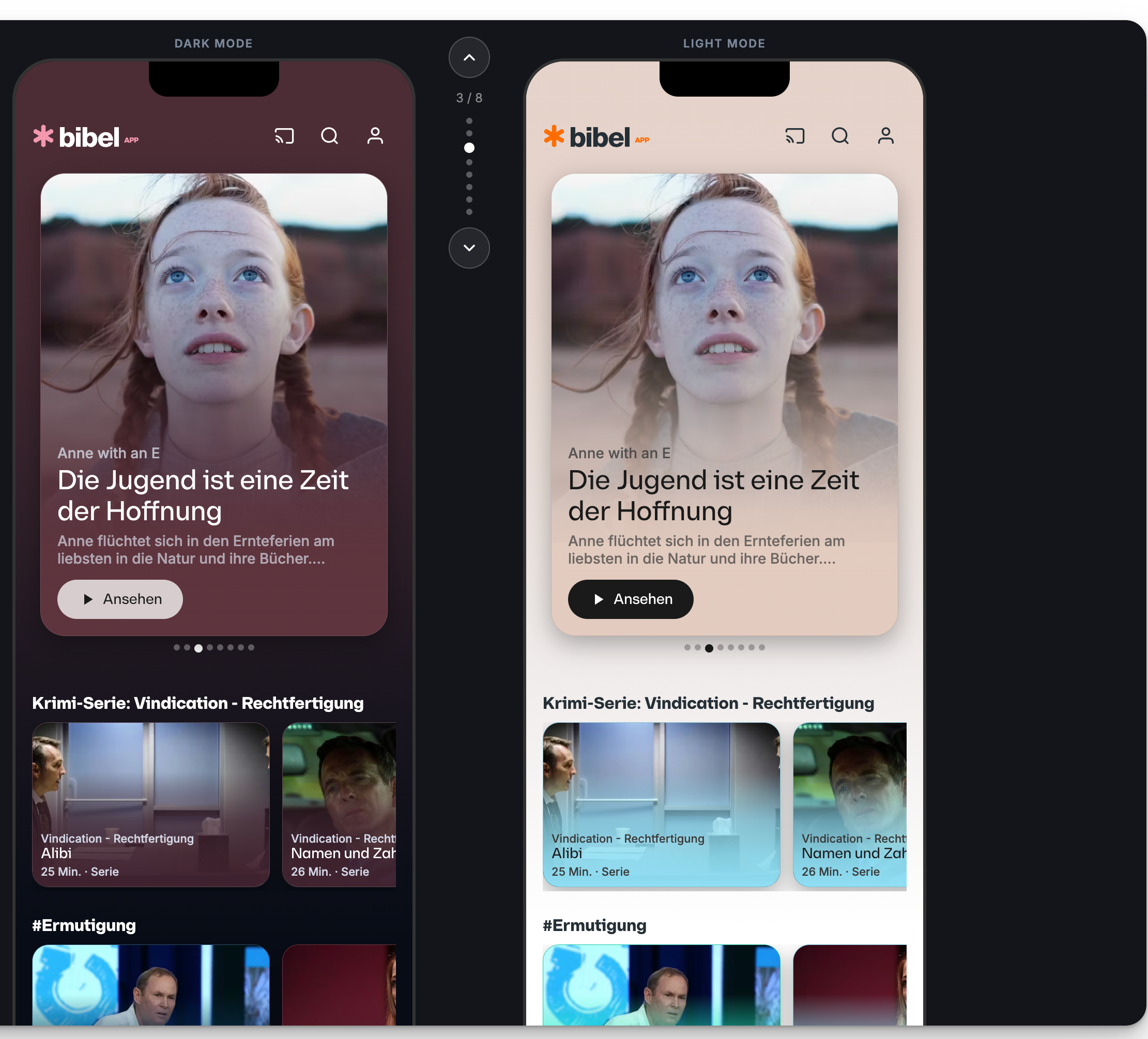
From a single piece of artwork, the API returns a full theme: a base color anchoring the card gradient, an accent for the logo, one or two text colors that clear AA or AAA contrast against the base without anyone checking.
The engine is tuned through Color Lab, the internal configuration tool shown above. The normalization curves and hue-exclusion gradients on the left of that screen are how the extraction is calibrated for Bibel TV specifically; the system is bespoke to one brand, not a generic per-brand tool. The two phone previews on the right show the same content card rendered in dark and light mode from the same extracted palette.
What changed
 View full size ↗
 - Light mode preference
- A concept survey (n=264) found 51% of respondents with a clear preference chose light outright and 32% chose a mixed palette — only 17% preferred dark alone, against the current app's dark-only default
- Contrast compliance
- Every extracted theme validated at AA or AAA, no manual checking
- Delivery
- Live in production. Color data is written onto every image in the content library, so each artwork ships with its theme pre-computed. The engine is also accessible through a Figma plugin when designers are working with those images.
Built two colors, shipped one
Infrastructure work is design work. The thresholds and filters inside the extraction algorithm are design decisions, and when you hand them to a generic library you hand over brand quality with them.
The other lesson was restraint. The engine can produce complex multi-tone looks. On a phone, the simpler output was the better one. Sometimes the design decision is to not use what you built.
Want to hear more?
- Curious why a color engine built for 10,000+ videos got tuned for light mode before dark, the reverse of the usual streaming default, or why the brand's own two-color hierarchy ships with only one color on phones, on purpose?